New Fanatics/Nike MLB jerseys destroy Rockies signature look
Apr 1, 2024, 2:18 PM
Photo by Griffin Quinn/MLB Photos via Getty Images
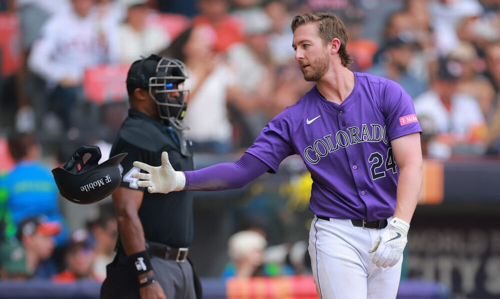
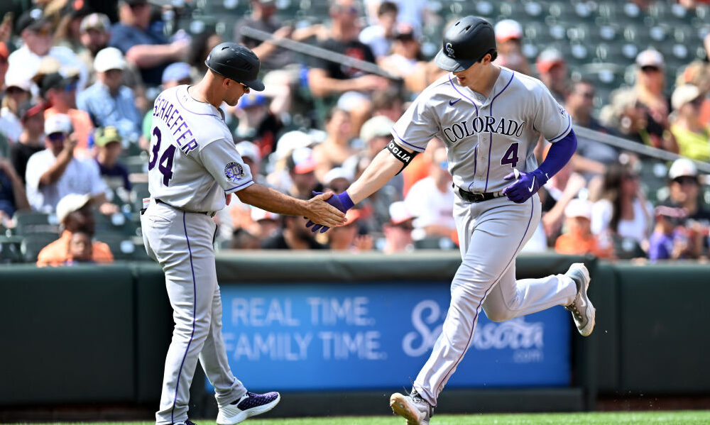
Are you feeling blue about the Colorado Rockies this season? Well, you may not be as blue as the club’s set of uniforms this season as the new template across Major League Baseball put in place by Fanatics and Nike appears to have ruined the Rockies signature purple.
The Rockies ditched their old more blue-tinted purple duds back in 2017, opting for a more true purple look over the last seven seasons. That switch officially saw Colorado go from Pantone Matching System (PMS) No 273 to PMS 2685, a more “purpley” purple.
The controversial new MLB uniforms, which have been designed and manufactured in partnership between Fanatics and Nike and have been heavily criticized. Issues range from managing sweat, the smaller name and number plates making the uniforms look more like knock-offs and overall a doctrine on pressing instead of stitching. These new uniforms most don’t feel meet the big-league standard and for the Rockies, it seems they haven’t captured the correct shade of purple.
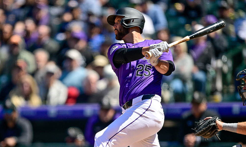
Here are two photos of Rockies Gold Glove centerfielder Brenton Doyle from this season and last, showing the difference in colors between the two uniforms. While some of the changes appear to be lighting in these photos, it does seem as though the color has changed in some way.
This year's purple vs last year's for the Rockies
H/T @Ben_Cary_ and Getty pic.twitter.com/G7eWxnrFdw
— Jake Shapiro (@Shapalicious) April 1, 2024
The picture above shows a bit of a difference in the change on the back of the jersey with the name and number plate but the photo below of two Nick Mears uniforms, one from last year and one from this year also shows pretty good how that has changed.
We used to be a proper country.
Thanks @Nike/@Fanatics. pic.twitter.com/3HSHUjn4VU
— Andrew Mason (@MaseDenver) March 31, 2024
At the time the Rockies made the shift in 2017, the Rockies director of retail operations Aaron Heinrich said at the time to MLB.com, “The purple that we had, the issue was for something that’s such a part of our core — the Rockies and purple are synonymous — that purple had a lot of variance.”
The Rockies dropped their black vest uniforms in the last few years, making the purple the de facto Rockies look.
“Just watching us on games, at different parks it looked different based on the lighting in the ballpark,” Heinrich said later in the story. “In some ballparks, it looked like we were wearing blue. In some ballparks, it was a dark purple.”
So even if the Rockies new uniforms haven’t actually changed the purple, which again it looks like they totally have, it’s erased the point of wearing this color purple in the first place—making sure that no matter the conditions Colorado looked like they were wearing purple and not blue. Now Monday’s breakout of the purples for the first time this season looked nowhere near as blue as the Chicago Cubs uniforms, but the purple, well it wasn’t as purpley.