So, what’s the deal with all the triangles on the new Broncos uniform?
Apr 22, 2024, 11:14 AM
(Photos by Gabriel Christus / Denver Broncos)
(Photos by Gabriel Christus / Denver Broncos)
The ubiquitous triangles could be the most controversial aspect of the new Broncos uniform template.
They are subtle, in that if you see the uniforms from afar, you might not notice them.
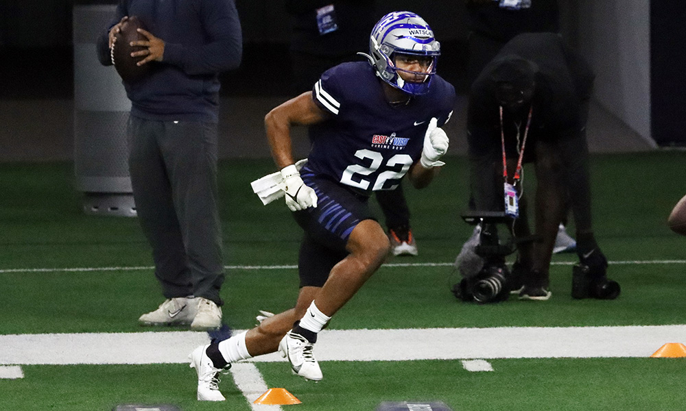
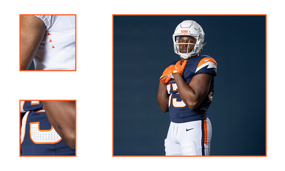
But when you look closer, you can’t miss them, because they’re on the helmet — effectively comprising the helmet stripe on both the blue and white helmets — as well as providing the perforation ventilation on the jersey numbers. There are also three triangles on the edge of the jersey front, just below the armpit.
“We were very deliberate and having three as a nod to our legacy tradition of three Super Bowl wins, as well,” Broncos chief marketing officer Hailey Sullivan explained.
That elicited a question from this reporter:
“So when you win another Super Bowl, do you add another?”
“We’ll cross that bridge when we come to it,” team president Damani Leech replied, smiling.
SO, WHY ARE TRIANGLES SO PREVALENT ON THE NEW BRONCOS UNIFORM?
Leech and Sullivan explained that they wanted the uniform set to reflect the Broncos’ Colorado home. And in particular, the team chose to lean into the mountain motif.
The sleeve-stripe pattern on the orange, white and blue jerseys comes to a point at the top layer resembling a mountain peak. The third layer — which is the base jersey color — appears jagged at its top, reflecting Red Rocks or the Flatirons.
The triangles came from how mountain peaks are indicated on summit markers and topographic maps.
On the navy and white helmets, they’re used as part of an arrow that goes from the base at the back of the helmet to the top of the crown.
“You can start to see a bunch of those triangle clusters at the base of the helmet,” Sullivan said. “… They all form together into a giant arrow that stops at the crown of the head to really symbolize our continued climb. Continued summit.”
The point on the arrow stops at the crown so that the triangles are never pointing down.
“It points and stops at the crown of the helmet,” Sullivan said. “… [They] start from the base so that it (the arrow) is always pointing up.”
The use of triangles on the new Broncos uniform is similar to how the Seattle Seahawks display a Native American-inspired feather pattern on their helmets, jerseys and down the sides of their pants.
On the jersey numbers, the prevalence of triangles decreases from bottom to top. Again, this has a mountain connection.
“They’re clustering at the bottom,” Sullivan explained. “They dissipate as you come up — as they dissipate as you come up, that is a nod to thinning air at higher elevations.”
BRONCOS SETTLED ON THE TRIANGLES ‘PRETTY EARLY’ IN THE PROCESS
In the meetings that took place regarding the uniform design, the Broncos wanted specific design elements that were nods to Colorado. In meetings that included Sullivan, Leech, co-owner Carrie Walton Penner, Broncos executives Kevin Johnson and Ted Santiago and longtime equipment manager Chris Valenti, the team and Nike worked through the design process.
Some elements came to fruition later. But they settled on the triangles “pretty early” in the process, both Sullivan and Leech said.
“Now where it showed up and all that iterated (over time), but I think we loved the idea of that,” Leech said.


