Ranking the worst alternate uniforms in Denver sports history
May 29, 2022, 10:27 AM | Updated: 4:09 pm
The Rockies’ City Connect unveiling Friday has yielded a gamut of responses.
To some, it’s a loving tribute to their state. To others, it makes the players into an ambulatory license plates. Others lament the fact that the Rockies turned the “City Connect” into a salute to the state, thus asserting that they missed the point of the exercise.
This is classic Rockies. The team should be named after a city, not a state, i.e. Denver Rockies, Denver Bears, etc. When tasked with choosing a City Connect jersey they chose State Connect.
Just giving idea that Denver is only a launching pad to other places in Colorado.
— Jake Shapiro (@Shapalicious) May 27, 2022
Some consider it a big misfire. Others like elements of it; I think the jersey works, although the pants and cap do not.
But is it among the worst alternates worn by Denver teams?
Let’s count ’em down.
First, a dishonorable mention:
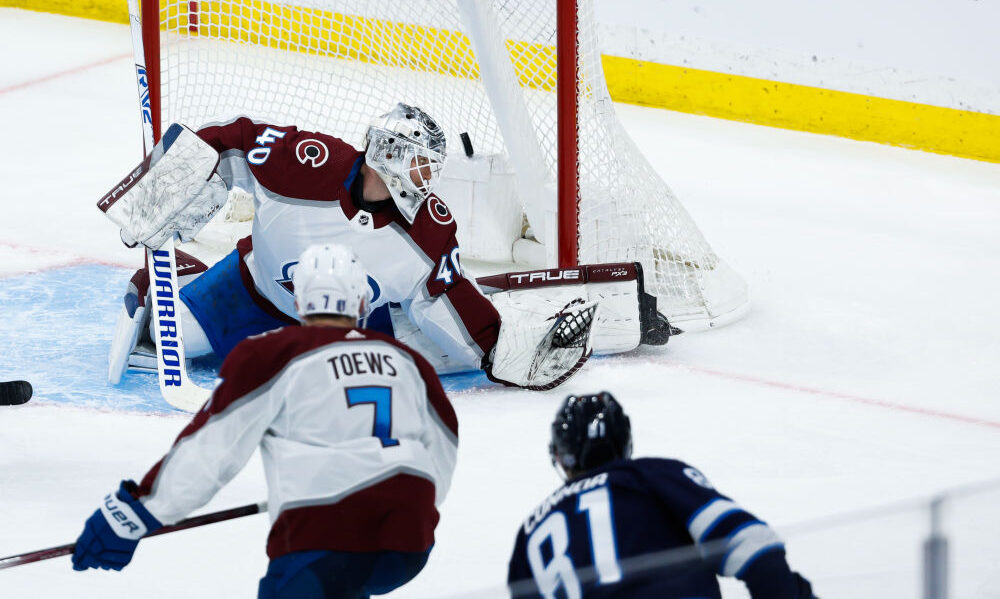
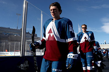
AVALANCHE REVERSE RETRO, 2021
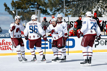
(Photo by Christian Petersen/Getty Images)
OK, I want to like these. The only item I own that is even tangentially connected to the Avalanche is a white Nordiques early-1990s vintage sweater. I have a thing for dead NHL franchises. If the NHL’s vintage-wear program would start cranking out Cleveland Barons gear, I’d be a happy man.
That being said …
This look is historical appropriation on skates. Taking the igloo and fleur-de-lis iconography from the city that you ditched and putting it the current color scheme that was never used before the relocation? That’s not cool.
Think of it this way: Imagine if the Broncos moved to Austin, Texas. They re-christen themselves as the Austin Armadillos. The team changes its colors to red, royal blue and yellow. Then it decides, “We’re going to play a game in Denver Broncos uniforms, but with our new colors!”
Sounds revolting, right?
Well, that’s what the Avalanche and the NHL did to Quebec with this “Reverse Retro” look.
If the NHL and Avalanche wanted to honor the Quebec Nordiques, they would simply wear a throwback look featuring Quebec’s light-blue-and-white scheme with red trim.
So, why isn’t this lower? Because from a design perspective, one can’t deny that this uniform looks GOOD. It’s hard to screw up a sweater with the iconic igloo logo and a smattering of fleur-de-lis.
But if the Avalanche truly wanted to pay tribute to the Nordiques, they would have worn the actual throwbacks.
Moving on …
5. NUGGETS CITY-EDITION RED-ROCKS RAINBOW, 2020-21
(Photo by Matthew Stockman/Getty Images)
The Nuggets have deployed many iterations of the rainbow-Tetris skyline look over the years. This is the only one that didn’t work. For starters, it comes too close to Utah’s City Edition red-rocks tribute of 2017-20. It also turns the rainbow into something dull.
This jersey forced a modification to a long-standing sentiment on Nuggets uniforms. Now, I add an “almost” before “anything rainbow is good.” At least this attempt was quickly retired.
4. AVALANCHE STADIUM SERIES, 2020
(Photo by Matthew Stockman/Getty Images)
Nothing about the Avs’ one-off game at Falcon Stadium on the Air Force Academy campus worked. Fans driving from the Denver area were stuck in gridlock that extended miles through I-25 in Douglas County. Some didn’t arrive until the third period. Many of those who made it dealt with endless queues at the merchandise and concession stands. To top it off, the Los Angeles Kings stole a win.
And then there were the Avs’ uniforms, which I imagine initiated from a conversation that went like this:
NHL EXECUTIVE NO. 1: “Hey, remember when the Vancouver Canucks had the big, yellow-and-red ‘V’ overwhelming the front of the jersey back in the early 1980s?”
NHL EXECUTIVE NO. 2: “Remember? Who could forget? It’s one of the ugliest uniforms in existence. And I was around for Cooperalls.”
NHL EXECUTIVE NO. 1: “Well, I was thinking we could turn it upside down, put it in Avalanche colors and bring it back!”
NHL EXECUTIVE NO. 2: “Sounds great!”
3. ROCKIES TURN AHEAD THE CLOCK, 1999
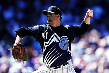
(Brian Bahr / Allsport)
Thankfully, the Rockies didn’t rebrand themselves like the New York Mets did. For a day, they became the “Mercury Mets,” theorizing that by 2021, there would be a team on the planet closest to the sun.
File that alongside the flying cars of “Back to the Future” as part of a future that never transpired.
The Rockies simply blew up their logo, turned their button-ups into a pullover, went sleeveless and went to work. There was no way to make this concept look good — although the sleeveless concept would return in a wonderful way several years later.
That said, the one-off uniform did yield an iconic moment: Larry Walker’s three-run, walk-off home run off the Braves’ volcanic and impetuous closer, John Rocker.
2. NUGGETS “WHITEGOLD,” 2015-17
(Photo by Matthew Stockman/Getty Images)
Otherwise known as the uniform with jersey sleeves.
Even without the sleeves, this would be a poor look. From a distance, the white numbers on a white jersey are difficult to discern. And for a franchise that has leaned into bright, bold colors throughout much of its history, this is a muted look which doesn’t fit with the Nuggets’ aesthetic.
1. BRONCOS 50TH-SEASON THROWBACK, 2009
Could it be anything else? This almost reaches the “so bad, it’s good” level of uniform.
Bonus points to the players who leaned into the ridiculousness of the look by pulling their socks around for a barber-pole effect.
(Photo by Doug Pensinger/Getty Images)
The Broncos have some gorgeous potential throwback looks in their closet. They have the mid-1960s throwbacks, last worn early in the 1994 season for a pair of losses. They have the classic throwback “D” on a light-blue helmet with orange jerseys. The Broncos last wore this on Thanksgiving Day 2001 at Dallas.
So, for aesthetic purposes, they have better choices for throwback days than this.
That said, the Broncos should pull the mustard-and-brown duds from closet every so often to remind fans of the club’s humble origins. After all, as an old Russian proverb cited by Aleksandr Solzhenitsyn goes, “Dwell on the past and you’ll lose an eye, but forget the past and you’ll lose both eyes.”
Given those options, the Broncos should try to thread the needle with an occasional, once-a-generation reminder. Bust out this look for one game every decade and that’ll be enough. Further, for those who view this look ironically, it’ll scratch the buying itch and move some merchandise.
In the end, isn’t that what alternate uniforms are all about?
***